Seven simple tips for designing shelf worthy packaging
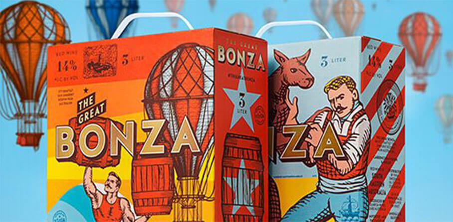
The fight for attention on our retail shelves is real.
Whether you’re in the supermarket, the specialist tea shop or the high end homewares store, our busy shelves are carefully curated and shop displays are beautifully arranged to catch our eye and command our attention.
Statistics vary on how long it takes to capture a shopper’s attention, but seem to average out at around 8 seconds or less. That’s a short window of opportunity to create an emotional connection with a stranger using the media of cardboard, colour or glass.
At our recent Packaging Design event, speakers outlined seven key ways to design packaging to create a meaningful connection with your audience that delivers sales, as well as protecting your product and covering all the legal aspects.
Design thinking is a human-centered approach to innovation that draws from the designer’s toolkit to integrate the needs of people, the possibilities of technology, and the requirements for business success.
- Tim Brown, IDEO1. Tell a story. Make it amazing
Very often, packaging is the first physical touchpoint that you have with your customer. It’s your first opportunity to shine and we all know that first impressions count. So, it helps to know and understand your own brand story so that you can communicate it in the simplest of messaging formats at that moment of impact.
If your value proposition is bright, bold and confident then make sure that the design echoes the same principles. Likewise, if your brand identity is a bit more subtle and understated, then your packaging should reflect this for consistency.
Tip 1
- Are you traditional, retro, modern or edgy? Tell your brand story with the help of the core elements that you use within your packaging.
2. Accentuate the aesthetics
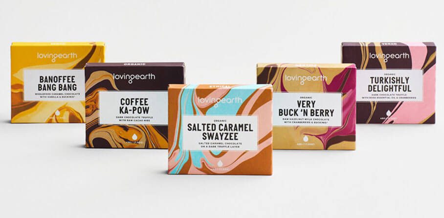
Source: Studio Round
Use colour, pattern, language, fonts, shape or texture to attract your customer. A beautiful, tactile box can be enough to persuade someone to buy regardless of whether they actually need what’s inside.
For food products, try rich, edible looking colours, with delectable names and dreamy descriptions to conjure up a sensory overload.
Tip 2
- Certain products (eg food and beauty items) can really benefit from the maximalist treatment. Use delightfully lit, professional imagery combined with rich language to ramp up the interest levels.
3. Branding the unboxing
A delivered package represents an excellent and underused marketing opportunity to connect with your customers via the unboxing experience. Careful consideration of the materials and messages (and how these are presented) can offer added value to your customer if done in the right way.
4 in 10 consumers will share an experience of a delivery on social media if it comes in a unique package. It works best if you can maintain the brand presence throughout the unboxing process.
On-body messaging on the inside of the packaging helps with this, or for a low cost alternative, a postcard inside the box can help to keep the conversation going for longer.
Tip 3
- Small details can all add up to make the experience more memorable (and more shareable).
4. Surprise them
Humour can be one of the best ways to establish a connection with your audience. Especially if it’s a good fit with your brand personality.
Using the contents of the packaging as part of the overall display can also create an amusing effect.
With Poilu paintbrushes, a face is drawn on the cardboard casing at the handle so that the brush itself looks like a beard. This is a witty twist on the standard paintbrush format and helps it to stand out.
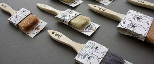
Source: Creative Bloq
Think about your product from lots of different angles. Does it look like anything else? Use lateral thinking to consider ways that it could be presented that stands out from the expected way of doing things. Don’t be afraid to try something new and get some feedback on your ideas before launching.
Tip 4
- Are there any ways that you can incorporate your product’s visual attributes into the overall display ? Or can you introduce an element of surprise or humour into your wording?
5. Be useful. Be resourceful. Be mindful
As we begin to move away from our well-earned reputation as a throwaway society, there’s an increasing responsibility on producers and designers to create packaging solutions that have more than a one-off use.
Try suggesting and encouraging alternative ways for your customers to reuse your packaging after the main event. Simple recycling tips on the box and advice on how to repurpose it can add a fun element but can also improve sustainability.
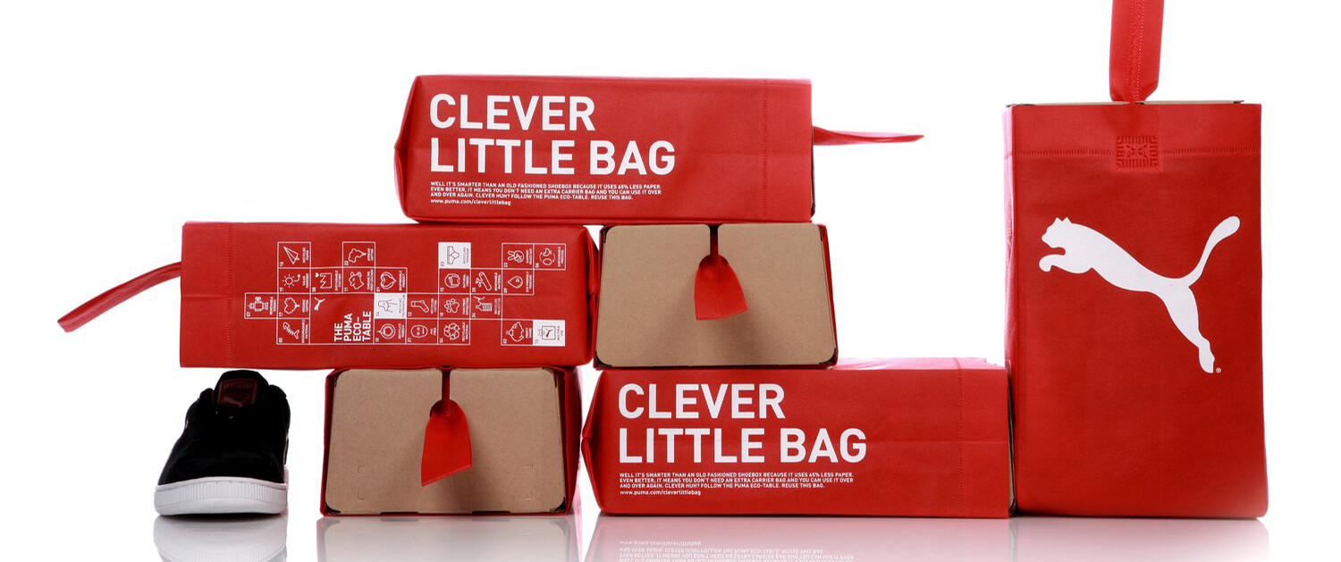
Source: inhabit
This clever shoe box turns into a handy tote bag and is a great example of how to throw away less. The strapline reinforces the underlying premise.
As customers continue to drive demand for more sustainable alternatives (particularly to plastic), it’s important to look at your whole approach to packaging solutions.
Plant based plastics, wood pulp cellophane and even seaweed water bubbles are a few of the latest innovative materials that are becoming more readily available.
One-off tooling costs can be less expensive than you might think so it’s worth having a chat with your print and packaging supplier to find out about new and emerging materials that might work for you. Work on simple pencil prototyping of potential design ideas to come up with something truly unique.
Tip 5
- Think about the full production chain in your business from the energy you consume in your day-to-day processes down to the inks and papers that are used in your packaging to how it will be disposed of (or not).
6. Innovate, create, improve
If you are a new business or start-up, you might be trying to find the most cost-effective, fast and innovative way to protect your product and get it safely to your audience. As time goes by, and hopefully as sales increase, you may come up against new challenges that force you to rethink some of your packaging options. Legislative changes, retailer demands and customer trends can all impact on how you decide to package up your product.
Tip 6
- Remember to keep reviewing your packaging to see if it is still delivering the best possible solution for your customers (and our environment).
7. Keep it real
Of course there is an infinite number of ways to create eye-catching packaging, but it is essential that you balance the limitlessness of your imagination with the boundaries of your budget. There is no point in producing phenomenal packaging that reduces your profit margin to an unworkable level.
This is where true design takes over.
Tip 7
- Working within the confines of a realistic cost framework, you need to make sure that you are solving all the important problems presented by your product pack (protection, labelling, stacking etc) whilst adding in enough creativity and imagination to differentiate it from the competition.


Comments